The average number of daily emails per person is about 88. That is quite challenging if you want your email newsletter to stand out from the crowd. Especially if you are still using some outdated methods. Therefore, we’ll make things easier for you. Here are some newsletter tips you can use and create your own brand new newsletters. Be original, and make others pay attention to your newsletters.
1. Pick A Color That Will Reflect Your Business Or A Brand

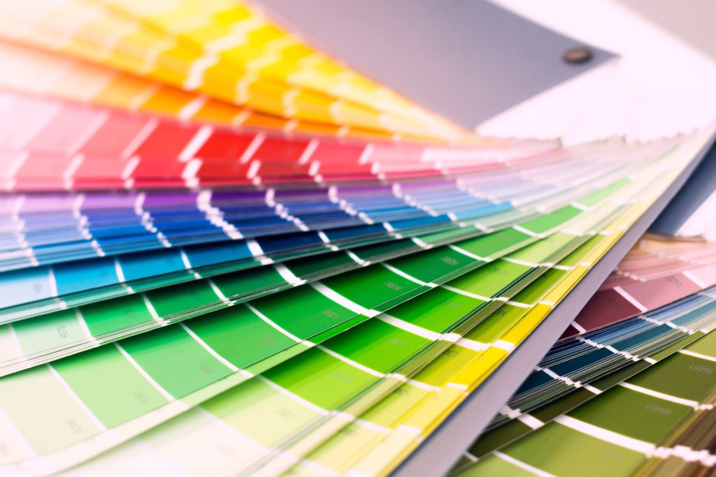
Though it may not seem important, color is a major point in making your company or a brand noticeable. Your newsletters will be the main tool for contacting your customers. Therefore, make sure that your newsletter design is matching your company or a brand. When designing a newsletter, use colors that include your company’s colors or reflects your brand.
2. Leave Some White Space In Newsletter Layout

We cannot say there is some limit on how long your newsletter template should be. It all depends on your needs. Some may be short and remind to an ordinary flyer. And yet, some may be longer than the novel. As we said before, it all depends on the information you want to include in your newsletter. But, whatever you choose to do, make sure you have some whitespace in your content. Whitespace has a role in your newsletter. Mainly, its role is to point out some things and draw attention. Besides, the text would be much easier to read.
3. Choose The Unconventional Layout For Your Newsletter

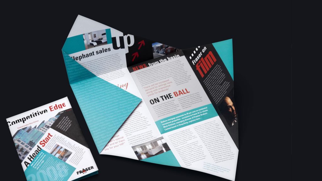
If you want to make your email newsletters more attractive and engaging – try some uncommon layouts. When creating newsletters, most people reach for simple solutions. That is usually left-to-right or top-to-bottom layout. If you have a lack of ideas, you can always use some professional help. But if you really want to stand out from the competition, try something different. Tips on how to have to use more effective email newsletter layouts you can find on this website. Try a more unusual layout that will give your customers a catchy reading experience.
4. Use An Attractive Header That Reflects Your Content

The email header is usually the first thing your customers see when opening one. That’s why you need to draw attention to an original header. Create one that reflects the content below. Try to use the header to make your newsletter theme closer to your readers. You may even do it so that you illustrate your ideas with icons, or use the letter fonts that will reflect the mood, etc.
5. Send Your New Subscribers A Welcoming Email

Before sending out a newsletter, it would be recommended to sending a customized welcoming mail to your new subscribers. These types of messages are 86% more rated than the standard newsletters. That makes sense. If you send your consumers a nice well-written email, your brand will be memorized. Your new subscribers will get a good impression of your company at the very beginning. Just develop a good email marketing strategy that will expand for more than just a welcome email.


